Using Color To Signal Task Complexity and the Need to Break It Down Further
This didn’t fit anywhere else but I think it may be interesting to others watching how my app’s UI is evolving.
I reworked my “Top Tasks” view with a few changes:
a. The task that’s “in-flight” get a blue background & finish button. The idea here is to that I stay focused on one thing at a time and don’t start another one in the meantime.
and…
b. Tasks in this list are assigned a color based on how how “doable” they are.
Here are the rules:
- If a task is too high-level, it’ll get a red button to signal that it desperately needs breaking down
- If a task is somewhat broken-down but not granular yet, it gets a yellow/orange button to signal it could be smaller
- If a task is very low-level and small, it gets a green button to signal that this is good to
Let me show you what I mean:
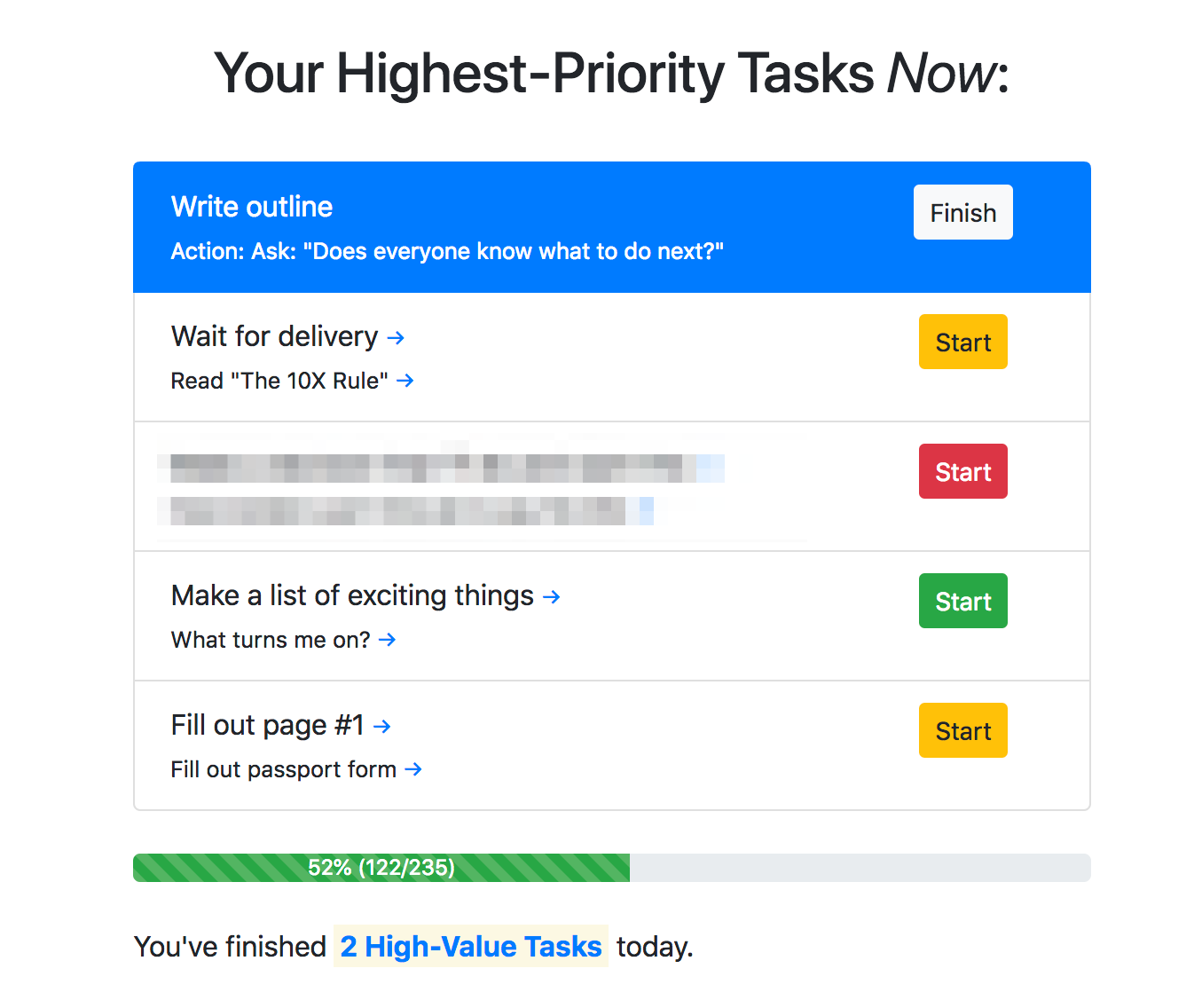
What I’ve found so far, is that this color-coding took a moment to get used to, BUT, it actually prompted me to break down the one with the red button further and I probably wouldn’t have otherwise. It’s still at “yellow” level but much better than before.
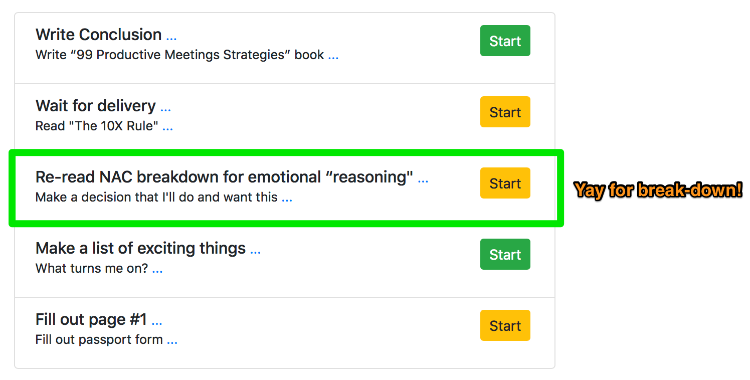
I’ll continue using this change for a few days to see if I can increase equal progress across all 5 major goals.
We’ll see!